Original Leonhart
The Company
Original Leonhart is a company with traditions. Founded in 1949, the brand not only stands for quality, but also for passion. Leonhart is innovation, because thanks to the imaginative founder Xaver Leonhart, there are renowned patents in addition to the foosball and billiard tables. For example, the so-called handkerchief lock, which laid the foundation for the manufacturer’s future career. But it’s not just the quality standards and patents that speak for themselves. The figures also say a lot about this company. So far, over 200,000 foosball tables have been built and sold worldwide. Almost every coin-operated foosball table in Germany is an original Leonhart! Thanks to their reach, they managed to become a partner of the German table football association DTFB. Sport is one of the most important aspects and values that the company represents. Only in cooperation with professional players was it possible to realise table projects that have been thought through from start to finish, creating a new experience for the player
Into the right light
Light not only attracts moths and other insects – it also attracts people. Light is the basic stylistic device of photography. Without this source, nothing would look the way it does with it. Above all, however, light is dynamic – a characteristic that Original Leonhart can confidently emphasise with its wide range of different foosball table models. For this reason, a concept was chosen that best communicates the brand’s characteristics in combination with the company’s core values to the outside world. The two colour components, red and blue, underline important aspects that describe the identity and origin of the brand: Red thus stands for pub sport with Original Leonhart. The pub is a place where it all began. A place that is often considered disreputable – and undoubtedly is. It is usually a dark place where joy, cohesion, excitement and fun come together. Blue stands for tradition with Original Leonhart. Tradition is very important to the company. As the company is based in Bavaria and the state flag represents the colour blue, it is used for this concept.
Leonhart's visual language
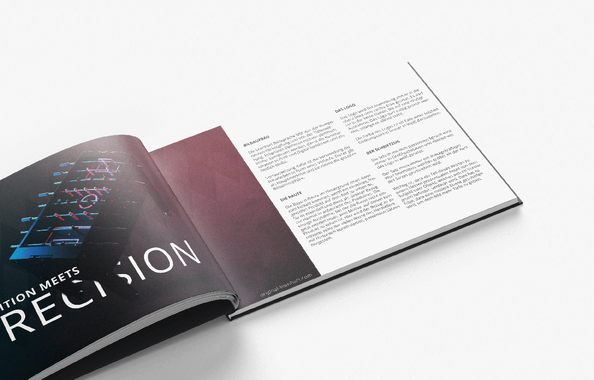
The Leonhart visual language thrives on the linking of components and the depth effect. Concise elements must therefore always be combined so that communication in print and digital remains consistent and uniform. The prerequisite for this is the use of corporate colours in the form of a gradient. This is the main feature and determines the overall image atmosphere.
THE ROUTE
The Bavarian rhombus in the background must be used when a single, cropped product can be seen in the picture. It is essential and serves as a direct reference to the home country in view of the product. The only exception where the diamond does not have to be used are motifs where no product can be seen. Here, the reference to at least one of the manufacturer’s many values is established with rhetorically constructed, appropriate sentences.
THE LOGO
When used, the logo is always placed in the top left or right corner. It may never be placed in the centre, with one exception: the logo may be placed in the centre as long as it stands alone. The colour of the logo must always be white in the case of such an image composition.
THE FONT
The font with the appropriate slogan is always set in capital letters and, like the logo, in white. The sentence must always contain a meaningful word that is written larger than the rest of the sentence. It is important that a small percentage of this word is covered by the subject or object in the foreground. As a result, a middle layer is created to give the image more depth.


