Elektro Meissner
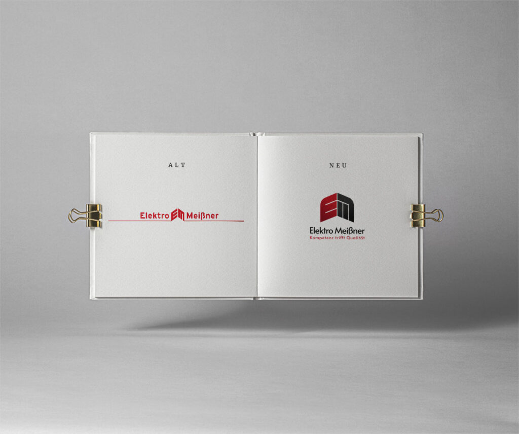
From old to new
The medium-sized company Elektro Meißner has been on the market for almost 60 years. Within that time a lot has been changed. But unfortunately, not much happened with the brand itself. I saw that issue and that’s how it all begun. The company itself with all their collegues and customers got nice and responsable values. These values had to be transform into a nice, modern brand which can proudly be shown along the country.
Logo Concept
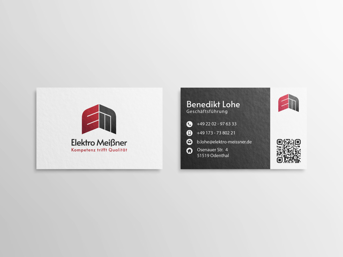
The concept for the redesign of the brand lay largely in the revision of the logo and the colours. Elektro Meißner had been getting by with an overlong logo for decades because digital media were not yet so popular. However, with the progress of the digital age, it was time to think about the format of the logo. The good thing was that the core of the logo was already there. It just needed to be reinterpreted in a modern way. The long line that ran from left to right had to be removed so that the new logo would also fit into the digital context. The E and M – the initial letters of the brand – remained. The letters didn’t work on their own, with the bright red colour and the angular edges. Of course, the capitals forming a roof was a good idea – but the whole thing still looked a bit lost. So I rounded off the corners on the left and right and gave the letters a more modern look. I also added another colour, anthracite, which was not only intended to create a stronger contrast to the red, but also as a secondary colour to make future design elements more interesting. Then came the lettering and the claim underneath, and the new logo in a modern format was ready to use.
Stationery & Website
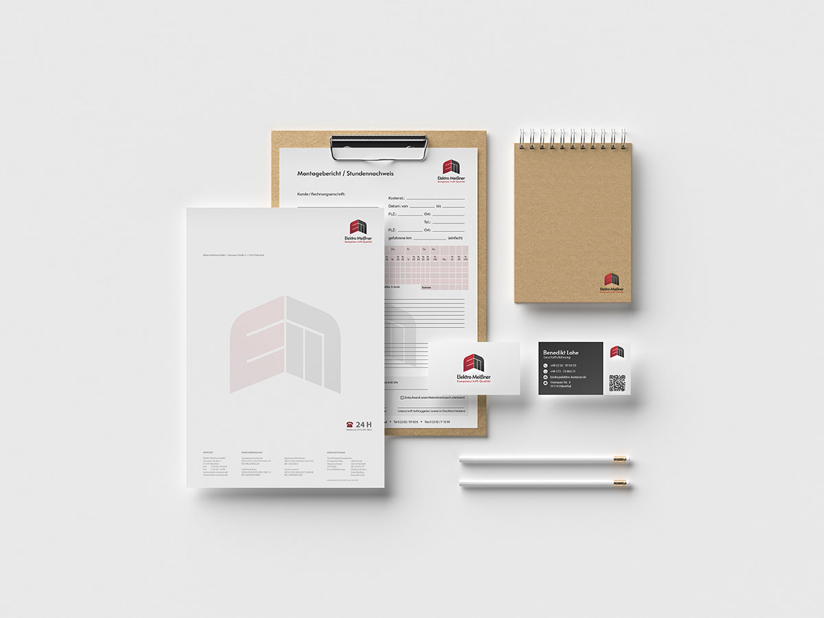
Every well thought-out brand needs a consistent repertoire of materials. Naturally, this also applies to Elektro Meißner. The task here was to present the newly developed logo and colours in such a way that it would at least be suitable for the majority of all print and digital media.
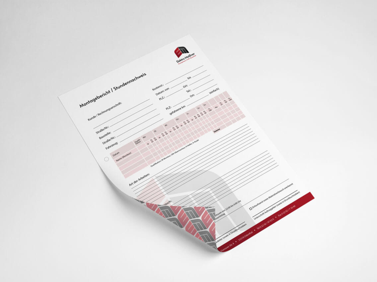
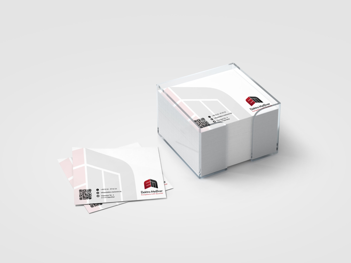
Thanks to the modern, minimalist redesign, it was now a child’s play to fill all materials with the right design elements. Letterheads, business cards, brochures, assembly sheets and many other marketing and business materials were created with a uniform look. Care was taken to ensure that the logo was always placed in the top or bottom right-hand corner (depending on the medium) and also slightly truncated as a watermark in the background to give the whole thing more weight in relation to the brand. The red-grey new world fitted perfectly on white backgrounds and the customer was accordingly happy to be able to hold his new brand in his hand.
So it wasn’t just a great success for me, but also a big win for Elektro Meißner, who hadn’t done anything about their brand for such a long time.
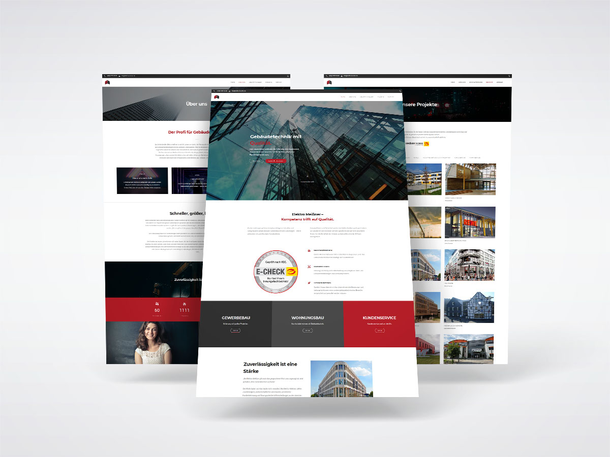
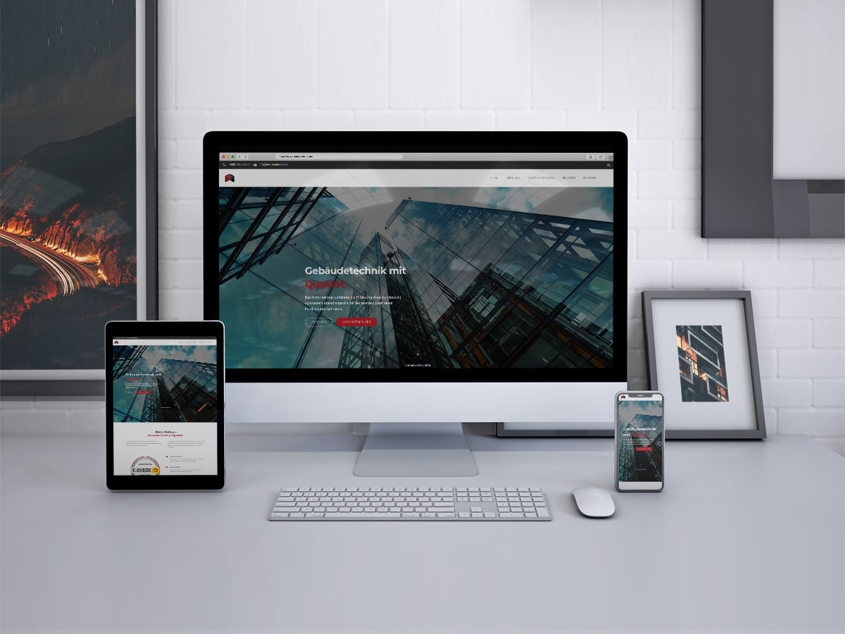
And not to forget the website, wich was fully customized with Adobe XD and implemented with WordPress.

